

Shivani logo
All projectsBrand guidelines / Shivani K J

§00 / Cover sheet

WalletGyde

WalletGyde branding project cover
Original wordmark
WalletGyde original logo
Identity / Application studies

A friendlier relationship with money.

Design
Shivani K J
Scope
Identity & system
Type / MontserratAa400 / 600 / 800
Color
#1F6FC5
#4CAF6E
#D8F0E0
#101613
#FFFFFF
10 chapters / Identity & product systemExplore the system
Contents

01 / Branding foundation

§01 / Brand foundation

Brand strategy & identity

Trust, everyday progress and approachable financial guidance.

Proposed strategy and messaging. Original artwork is identified throughout.

Mission
Make everyday money decisions feel more approachable.
Vision
Confidence built through small, consistent money habits.
Values
Clarity, accessibility and practical support.
Personality
Optimistic, honest and approachable.
Audience
People building budgets, savings and financial goals.
Positioning
A friendly guide for everyday financial progress.
Voice & messaging study
Little steps. Meaningful progress.

Clear, supportive and direct. No jargon, pressure or promises.

§02 / Brand foundation

Logo system

WalletGyde primary logo
Original primary logo
WalletGyde logo on dark
Reverse treatment study
Lockups
Retain the supplied wordmark. Standalone symbol and vertical lockup remain to be defined.
Clear space & size
Proposed: one letter-height of clear space; 96px minimum wordmark width. Validate legibility in context.
Incorrect usage
Do not stretch, rotate, recolor or place over competing imagery.
§03 / Brand foundation

Color system

HEX / Brand palette

Tint 01Tint 02PrimaryShade 01Shade 02
Roles
Blue leads actions. Green highlights growth. Mint supports quiet surfaces.
Semantic colors
Separate success, warning and error from decorative accents. Pair color with text or an icon.
Contrast target
WCAG 2.2 AA: 4.5:1 for normal text, 3:1 for large text and essential UI. Test each pairing; do not assume brand colors pass.
§04 / Brand foundation

Typography

MontserratDisplay / 600
AaCap heightBaseline
600

Make room for your goals.

DM Sans / Body & interface

Heading 01 3rem / 1.15

Heading 02 2rem / 1.25

Heading 03 1.25rem / 1.4

Body text 1rem / 1.6

Supporting text 0.875rem / 1.5

Proposed scale. Zero letter spacing. Small-screen headings step down to 2.25rem; body stays at 1rem.

§05 / Brand foundation

Visual language

Visual language study. The imported source includes one original logo, not a complete illustration or mascot library.

Wallet
Money
Savings
Growth
Protection
Goals
Shapes & icons
Rounded geometry, simple outlines and restrained upward movement.
Photography
Proposed: natural, everyday money contexts. A dedicated photo library is not supplied.
Illustrations & texture
Keep supporting art quiet and purposeful. No mascot or texture library is defined yet.

02 / Product design system

§06 / Product system

Foundations & design tokens

Proposed foundations for the system studies below, not verified production specifications.

4px
8px
16px
24px
32px
48px
Grid & breakpoints
12 columns on desktop, 8 on tablet, 4 on mobile. Proposed breaks: 48rem and 64rem.
Size & spacing
4px increment; 8px rhythm. Controls use stable sizing with room for longer labels.
Radius & borders
8px surfaces, pill actions. 1px borders separate quiet content.
Elevation & opacity
Subtle shadows for overlays only. Disabled controls reduce emphasis without hiding labels.
§07 / Product system

Core UI components

Interactive component studies using illustrative content.

Buttons & states

Default · outline · disabled

Inputs & selection

Feedback & loading

Changes saved

A name is required.

Loading stateDraft

Single choice & help

Reminder frequency
Reminder details

Preview reminders are not sent.

§08 / Product system

Advanced UI components

Savings progress

60%

Illustrative data

Example activity
GoalStatus
Emergency fundIn progress
Monthly budgetDraft
Navigation & tabs
One active location, readable labels and visible keyboard focus.
Tables & pagination
Keep labels attached to values. Add pagination when records exceed the visible set.
Overlays & charts
Dialogs focus on one task; drawers retain context. Charts need text summaries and labeled values.
§09 / Product system

Product-specific components

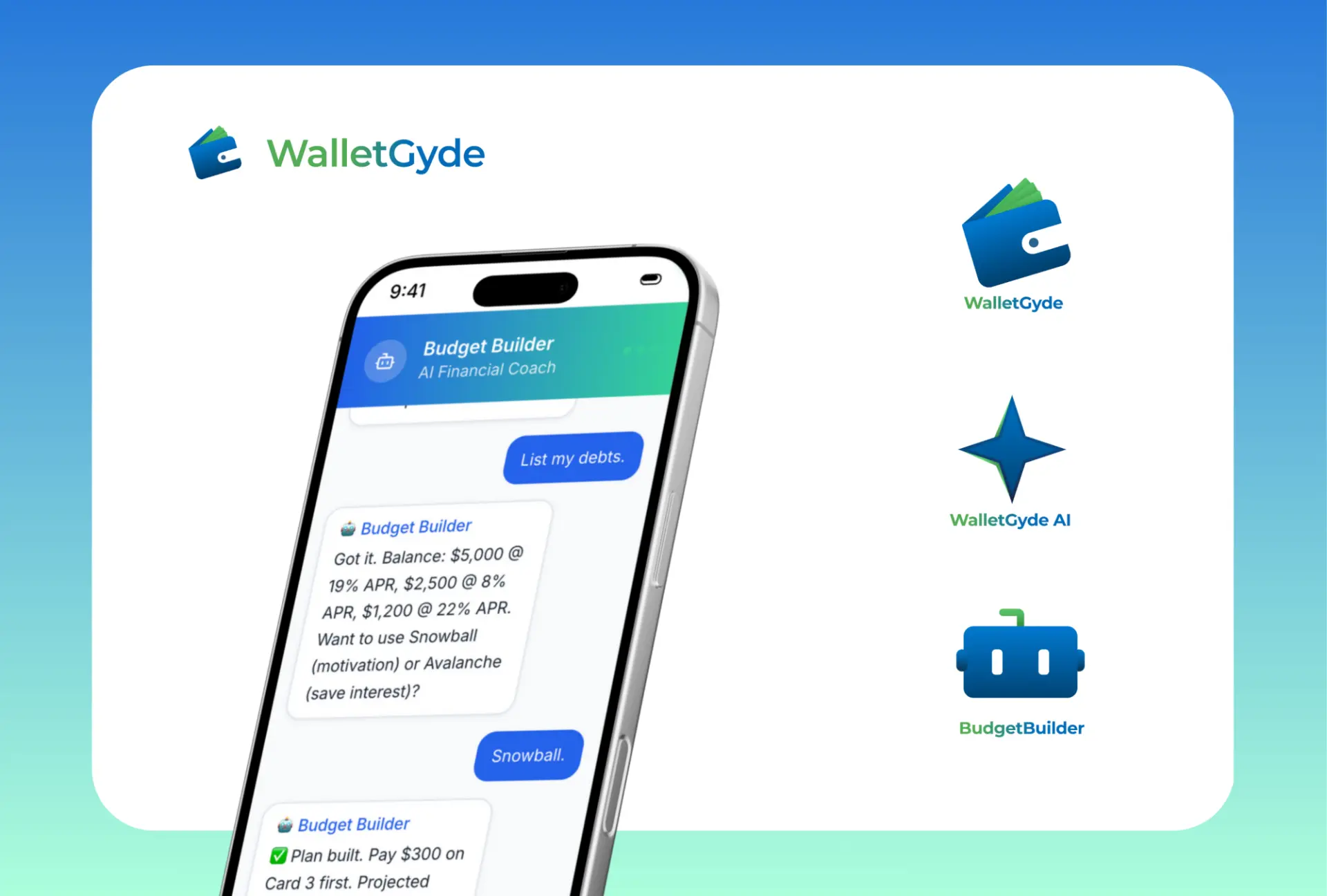
Original WalletGyde identity and application board
Budget overview
Proposed: income, spending and remaining balance in a clear summary.
Savings goals
Proposed: progress, contribution and next-step patterns.
Money guidance
Proposed: supportive prompts with clear context, not financial guarantees.

WalletGyde product templates are studies. No original product component library was supplied.

§10 / Product system

Responsive patterns & accessibility

Desktop
≥ 64rem
Tablet
48–64rem
Mobile
< 48rem
Keyboard & focus
Reach every control by keyboard, keep focus visible and return focus after closing overlays.
Errors & motion
Associate errors with inputs. Announce updates. Respect reduced motion.
Text & targets
Preserve content at 200% zoom. Aim for 44px touch controls; meet WCAG 2.2 AA target-size requirements.
Dark mode
Proposed: dedicated surface and text pairs. A reverse logo alone is not a validated dark theme.

Accessibility targets, not a compliance certification. Contrast, assistive technology and full product flows require validation.