
Usability Framework: Car
Evaluating the electric vehicle experience
Overview
About the project
Case study
About the project
Overview
About the project
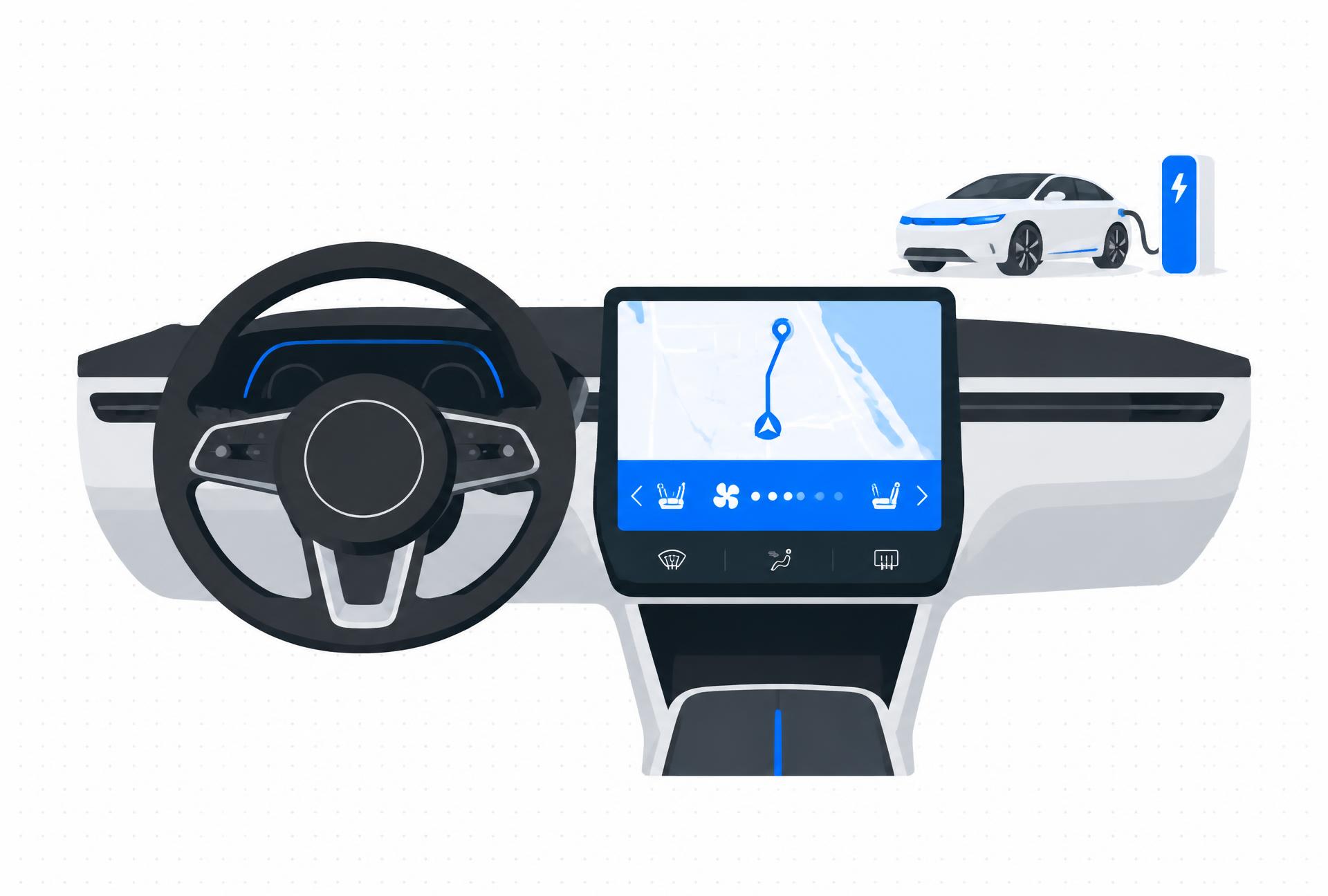
Our team developed a usability framework to evaluate electric vehicle interfaces, from navigation and climate controls to everyday dashboard interactions.
The project began with an interface redesign question. Research shifted our focus toward a repeatable way for designers, researchers and engineers to identify usability problems at the task level.
Project direction in the report, p. 10Case study
Problem
Touchscreen menus, unfamiliar controls and buried settings can distract drivers. The project asks how to evaluate individual actions in context, rather than relying on interface preference alone. Research findings, pp. 10–11.
Case study
Research
Process
What we did
Secondary research
Reviewed connectivity, safety, human-machine interaction, cognitive perception and EV-specific needs.
Driver survey
Collected 48 responses over one month, using rating scales and open-ended questions about car interfaces and EV concerns.
User interviews
Interviewed five drivers: three EV users and two non-EV users. Dashboard photos helped ground the conversations in their own cars.
Framework development
Used thematic analysis to identify six usability indicators and create a two-phase task evaluation method.
Finding
Preference is not the whole experience
The report states that 53% of survey respondents preferred touchscreens. In interviews, frequent drivers described touchscreens as distracting and suggested combining them with physical buttons.
This contrast informed a task-specific approach: evaluate how a control works in context, not just which interaction style people say they prefer.
Case study
Persona: user needs and requirements
People
Different drivers, different needs
Illustrative personas from the project summary, not individual research participants.
Ted Mosby
Architect
Frustrations: Too many touchscreen menus and unfamiliar icons.
Needs: Clear visual cues, onboarding support and fewer distractions.
Robin
Journalist
Frustrations: Buried settings, missing shortcuts and slow responses.
Needs: Faster navigation, customizable controls and device integration.
Barney Stinson
Businessman
Frustrations: Small text, unclear voice prompts and hard-to-find basic controls.
Needs: Larger touch targets, voice guidance and simpler interactions.
Case study
Solution
Framework
Six lenses for every task
01
Self-identification
Can drivers recognize a control and understand what it does?
02
Accessibility
Are controls easy to see, reach and use?
03
Feedback
Does the system clearly confirm actions and show its status?
04
Consistency
Do labels, icons and controls behave predictably?
05
Hierarchy
Are important information and frequent actions easy to find?
06
Task completion
Can drivers finish a task without unnecessary steps or errors?
01. Break down the task
Define a goal, identify sub-goals and split them into individual actions. For navigation: locate the control, enter a destination and start the route.
02. Evaluate each action
Score each action against the six indicators on a 1–5 scale, from failed to excellent. Record the reason for each score and opportunities for improvement.
Case study
Next steps
Outcome
A framework, not a proven redesign
The deliverable was a task-based evaluation framework with a scoring table and a navigation example. It was not a shipped vehicle interface or evidence of reduced driver errors.
Manual scoring remains a limitation. Further work could compare first-time and frequent drivers and adapt the framework to different vehicles.
Report
Read the full report
A Novel Usability Evaluation Framework for Electric Vehicles. The 13-page academic report includes the research, six indicators, task scoring example and references.
Open the full report (PDF)